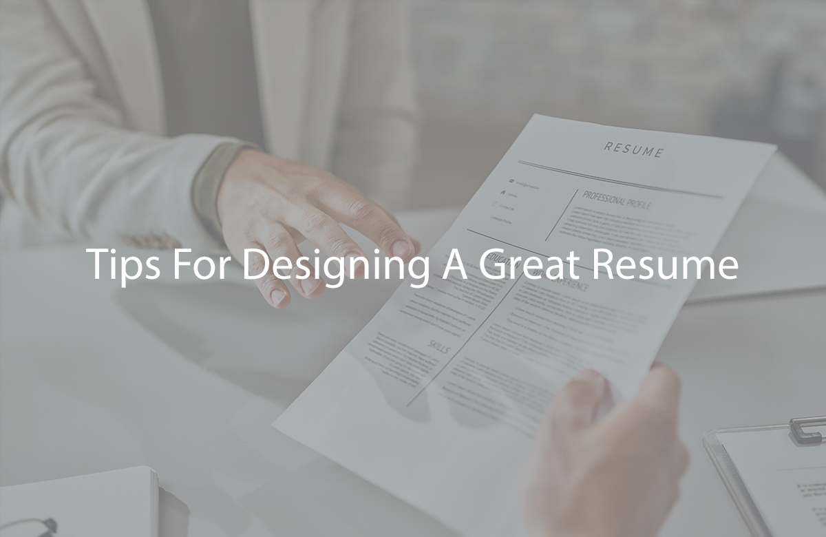
Tips For Designing A Great Resume
Designing a great resume is crucial to grab the attention of recruiters and showcase your qualifications effectively. Here are some tips for creating an eye-catching and professional resume design:
Choose a Clean and Readable Font:
Use a standard, legible font like Arial, Calibri, or Times New Roman.
Maintain a consistent font throughout your resume for a cohesive look.
Use a Font Size that’s Easy to Read:
Keep the main body text between 10 and 12 points.
Use slightly larger fonts for section headings and your name.
Create Clear Section Headings:
Use bold or a larger font size to make section headings stand out.
Employ a clear hierarchy with larger headings for major sections (e.g., “Work Experience,” “Education”) and slightly smaller headings for subsections (e.g., job titles, company names).
Employ Bullet Points:
Use bullet points to list your achievements and responsibilities within each job or experience entry.
Bulleted lists are easier to scan and read than paragraphs.
Use Consistent Formatting:
Maintain a consistent format for dates, job titles, and company names.
Ensure alignment and spacing are uniform throughout your resume.
Incorporate White Space:
Allow for sufficient white space around text and between sections. This prevents your resume from feeling cluttered and enhances readability.
Consider a Two-Column Format (Optional):
For experienced professionals with extensive qualifications, a two-column format can help you fit more content on the page while maintaining readability.
However, be cautious when using this format, as it may not be ideal for all industries or applicant tracking systems (ATS).
Use Bold or Italics Sparingly:
Use bold or italics to emphasize key points or headings, but avoid excessive formatting that can distract from the content.
Incorporate Color Sparingly (If Appropriate):
While most resumes are best in black and white, adding a subtle touch of color to headings or accents can make your resume visually appealing.
Ensure the colors you choose are professional and don’t distract from the content.
Include a Clean and Professional Header:
Place your name at the top of the resume in a larger font.
Include your contact information (phone number, email, LinkedIn profile) in a clear and organized manner.
Use Consistent Margins:
Maintain one-inch margins on all sides for a balanced and well-structured layout.
Consider a Visual Divider:
Use a simple horizontal line or subtle graphic element to visually separate sections or highlight key points.
Include Relevant Icons or Symbols (Optional):
Some resumes use icons or symbols (e.g., phone icon for contact information, envelope icon for email) to add visual appeal. Be sure these are simple and relevant.
Test on Different Devices:
Open your resume on various devices (computer, smartphone, tablet) and software to ensure it retains its formatting and readability.
Customize for Your Industry:
The design of your resume should align with your industry. For creative fields, you may have more design freedom, while conservative industries may require a more traditional format.
Print a Hard Copy (If Needed):
If you plan to submit a physical copy of your resume, ensure it looks just as good in print as it does on the screen.
Seek Feedback:
Ask friends, mentors, or professional contacts for feedback on your resume’s design and layout.
Remember that a well-designed resume should enhance, not detract from, your qualifications and content. Prioritize readability and professionalism while considering the preferences and expectations of your target industry and employer.
